The Water Hub Hackathon; We won!
Published: April 20, 2018
Well well well, we’ve only gone and won The Water Hub hackathon! Well, joint winners but the main word is WINNER. First of all we want to say thank you to all the guys at the Water Hub and the Sunderland Software Centre for organising and inviting. There was some tough competition there and we are thrilled to have been ajudged joint top! Here’s how we won:
The first day started off with presentations from Antonia Scarr and Matt Starr from the enviroment agency (who we apologise profusely to for constantly harassing about their current system and data), Martin Colling from the Wear Rivers Trust and Louise Bracken of The Water Hub. Whilst we were listening to some passionate presentations about the enviroment and the problem at hand we were able to tuck into some free bacon and sausage sarnies!
The main problems we thought the presentations established were:
- The Enviroment Agency have created a fantastic data exploration tool with a TONNE of data available in it but it’s a little difficult to navigate and the API documentation is difficult. The data exploration tool along with all the data is available to view here.
- To help the enviroment, we need to engage a wide audience and encourage people to use the available data but because of the difficult/scary data exploration tool it is not easy to do so.
- No way for current users of the data who want to share their insight to integrate with the existing tool directly
We then established a few criteria our app should meet based on these presentations and a few chats with people around the room:
- Ability to subscribe to data updates
- Better visualisation tools
- Ability to look at multiple regions at once
- Improve user experience with reduced page load times
- Modularity
So we came up with a product to tackle these problems. In reality it’s a collection of more focused products that sit together through a single web application. The bonus of this is that if we then develop more tools they will just slot into the app without us having to completely redesign the whole thing.
With this being a hackathon and having less than 24 hours to design, build, re-design, and re-build our final application this modularity allowed each of us to work on fairly independents components without worrying about breaking the others’ code.
The three products that make up the app are:
- A map giving you the ability to chose more than one area for evaluation
- A simpler more consistent and visually appealing documentation for the API (This was actually added as we went along as we found the existing one to be a bit unfriendly)
- The ability to explore the API in a more visual way
- The ability to generate Example API queries in the page - (could copy and paste out to your application)
- A bespoke reporting tool
- This included dynamic html based reports generated from regions and data sets of interest in the explorer
- The ability to print these reports straight to pdf file (I still can’t believe you were copying tables and graphs over by hand.)
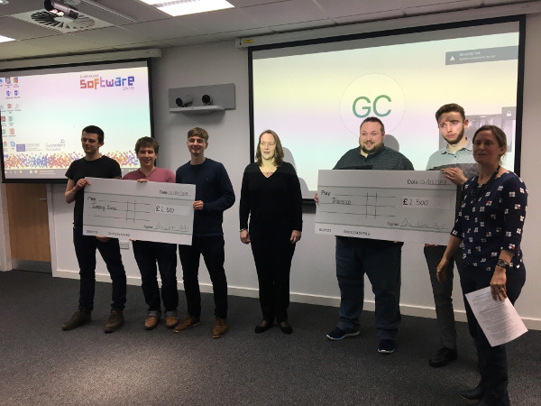
Here’s a cheeky picture of us being winners:
Quick demos of the ‘final’ product:
- A walk through of the app and it’s help modes
- A walk through of the API page
- A walk through of the map and report generator pages
- A walk through of the voice command feature
And a few of the more technical details:
To begin with we chose some technologies well-suited to, or designed for, implementing paramaterised reporting, statistical analysis, and interactive data exploration. For us this was R with RStudio, Shiny, and Rmarkdown.
RStudio allowed us to each grab bits of the catchment planning data from their APIs and explore the consistency, coverage, and general structure. Together we discovered that (1) understanding the API and data structures can initially be hard, and (2) a few small tweaks could make the experience much better for ourselves and for others who would access this data in the future. The quality of the data (once understood) was very good and would provide us plenty to work with.
The first tweak was to redescribe the API with the OpenAPI Specification, by providing a representation of the endpoints that was both human and machine readable we could quickly generate an interactive version of the API. This allows both navigation through the data structures and also provides real-time previews of the requests required to fetch any data and results from those requests.
We liked the concept of navigation through the catchment planning data via maps, but the experience could be smoother. The existing navigation tool requires selecting one of many regions on a zoomable map, and then leaving that page to see a new map where you could further select smaller regions. The necessity to reload the entire page and display a new map can hinder the user experience if the users are not already familiar with these areas. We proposed to re-use the same map while refining the region selection process, reducing page navigation and context switching.
A second result of the existing design was that the refinement process is strictly hierarchical. If you wish to examine data from two neighbouring water bodies (the smallest region type) you may have to navigate back to the very first page if they happen to fall across two different river basin districts (the largest region type), or similar across management catchments and operational catchments. Using a single map view would allow us to easily select multiple water bodies from within any parent areas. To build this interface we created a Shiny app with the Leaflet.js plugin and a little bit of customisation.
Finally, the reporting tools that existing users would expect from the current website were to be reproduced, but now with more control over the bodies included in each summary. Once again, Shiny and R allowed us to gather all the required data from the environment agency’s APIs and generate a few of the summary tables and graphics as a proof of concept. Additionally, using Shiny we could further filter the data displayed.
These two shiny apps and the interactive API run independently and are brought together by the final web UI.
Final report documents can be generated from the interactive report Shiny app as it is written using R Markdown, an interpreted markup language allowing reproducibility and configurability of documents in a variety of output formats including PDF.
We kept our code in a single git repository during development and described the requirements to run each component with a Dockerfile. The Dockerfile actually describes everything requried to build an environment within which the application will run, from the operating system, to the packages, any additional software, services, and configurations, and finally the application itself. A docker-compose.yml file describes the relationships between our three main services allowing them to communicate with each other and the users.
Of course, our presentation pitch was also produced with R Markdown.
We’ll be writing more about our containerised workflows in a future blog post.