Github
LinkedIn
Twitter
YouTube
RSS

R from the turn of the century

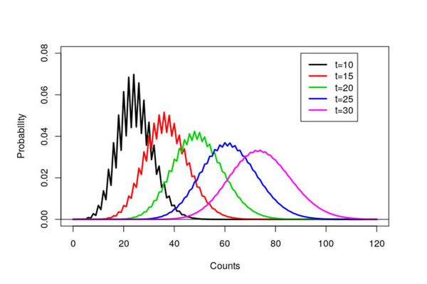
Last week I spent some time reminiscing about my PhD and looking through some old R code. This trip down memory lane led to some of my old R scripts that amazingly still run. My R scripts were fairly simple and just created a few graphs. However now that I’ve been programming in R for a while, with hindsight (and also things have changed), my original R code could be improved.
Animating the Premier League using {gganimate}

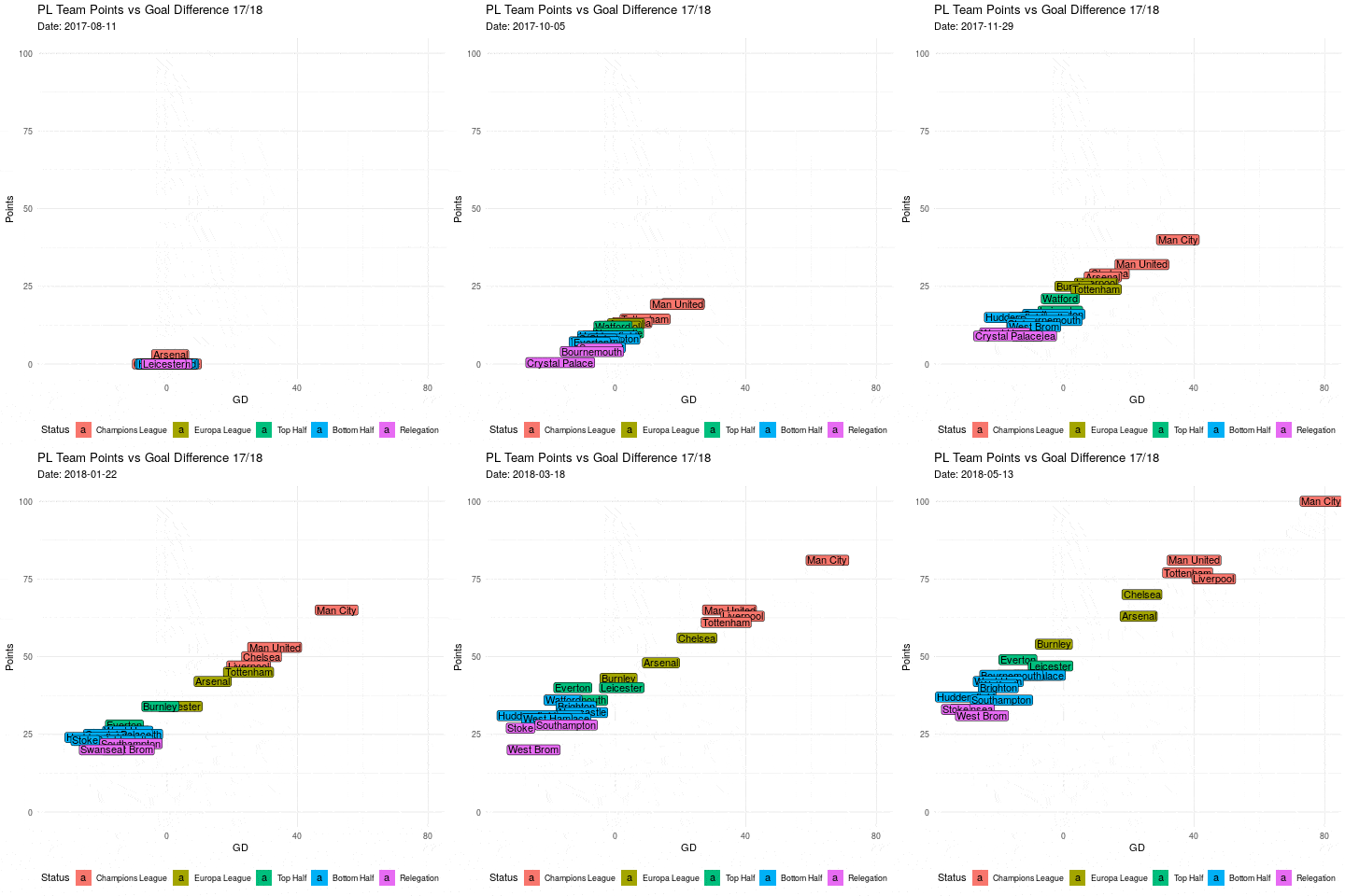
Ever wonder what an evolving gif of each premier league team’s goal difference vs points would look like made in R? Look no further! Most of this is going to be setting up the data (as always) instead of actually plotting the data. To get the data into shape, we’re going to be using the {tidyverse} and {lubridate}, which you can install the usual way via install.packages(). To animate the data we’ll be using the {gganimate} package.

Styling {ggplot2} Graphics

Styling {ggplot2} graphics In our previous post, we demonstrated that contrary to popular opinion, it is possible to generate attractive looking plots using just base graphics. Although we did confess, that it did take a lot of time and effort. In this post, we repeat the same exercise. Using the dreaded iris data set, we’ll first create the default {ggplot2} graph, before applying a bit of care and attention. The standard ggplot version The standard scatter plot is straightforward to create.

Our Logo In R

Hi all, so given our logo here at Jumping Rivers is a set of lines designed to look like a Gaussian Process, we thought it would be a neat idea to recreate this image in R. To do so we’re going to need a couple packages. We do the usual install.packages() dance (remember this step can be performed in parallel). install.packages(c("ggplot2", "ggalt", "readr")) We’re also going to need the data containing the points for the lines and which set of points belongs to which line.

Comparing plotly & ggplotly plot generation times

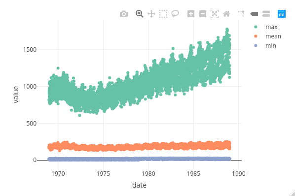
The {plotly} package. A godsend for interactive documents, dashboard and presentations. For such documents, there is no doubt that anyone would prefer a plot created in {plotly} rather than {ggplot2}. Why? Using {plotly} gives you neat and crucially interactive options at the top, whereas {ggplot2} objects are static. In an app we have been developing here at Jumping Rivers, we found ourselves asking the question would it be quicker to use plot_ly() or wrapping a {ggplot2} object in ggplotly()?